In the ever-evolving landscape of web design, avoiding common pitfalls is crucial for both user experience and SEO. We’ve gathered insights from SEO experts, including a consultant and a director, to pinpoint seven specific mistakes to steer clear of. From using too many elements to not considering accessibility features, these professionals provide valuable guidance for your next web project.
- Too Many Elements
- Overlooking Mobile Responsiveness
- Misused Pop-Ups
- Inconsistent Menus
- Ignoring Functionality
- Failing to Optimize for Search
- Not Considering Accessibility
Table of Contents
ToggleToo Many Elements
One specific mistake I see too often is leaving too many elements on mobile before the reader gets to the content.

On the desktop, we have a lot of space, so we can put the table of contents to the left, an “also read” section to the right, and the content below the feature image in the middle. On mobile, we don’t have a lot of space, so we stack everything.
The problem is that when we start stacking on top of the content, you’re not answering the query that your blog post is targeting fast enough because the reader needs to scroll a couple of times.
This is a bad user experience and affects your rankings.
You can still stack but minimize your elements, such as a table of contents and a read-more section. Then you answer the query immediately, and you allow for the reader to interact with your website, which is positive for your rankings.
Win-win.
Phillip Stemann, SEO Consultant, Phillip Stemann
Overlooking Mobile Responsiveness
One specific mistake to avoid in web design, particularly one that can negatively impact user experience and SEO, is overlooking mobile responsiveness. In today’s digital age, where many internet users browse on their smartphones and tablets, having a responsive website is crucial.

Failure to optimize your website for mobile devices can lead to a poor user experience as visitors struggle to navigate through tiny text, distorted images, and unclickable buttons. This frustration can drive users away from your site, increasing bounce rates and decreasing conversions.
Moreover, search engines like Google prioritize mobile-friendly websites in their rankings. If your website is mobile-responsive, it may improve SEO performance and visibility in search results.
To ensure a seamless user experience and maintain good SEO practices, web designers must prioritize mobile responsiveness during the design process.
Thomas Niemczewski, SEO Specialist, Dream Chasers
Misused Pop-Ups
Misused pop-ups can quickly turn website exploration into frustration, earning disapproval from both users and Google—particularly on mobile, where they can severely disrupt navigation. This can impede a site’s ability to rise in search engine rankings. Employing pop-ups wisely is key to avoiding turning an online adventure into a navigational nightmare.
Harry Boxhall, SEO Freelancer, Boxhall SEO
Inconsistent Menus
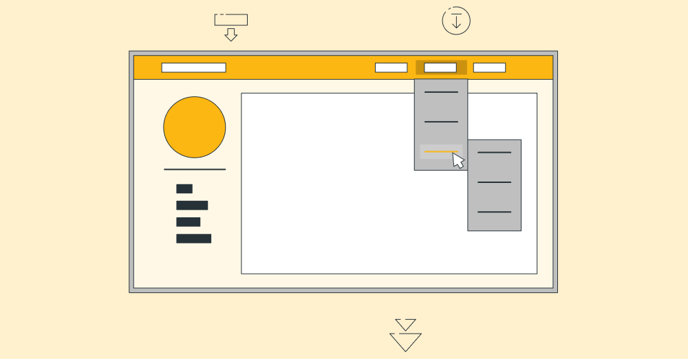
One thing to watch out for in web design is not giving enough attention to your mobile site’s menu. A lot of times, mobile versions get simpler menus than desktop sites because of the way some website themes are set up. This means people might not find the same stuff on their phone as they would on a computer, which can be annoying and confusing.

To fix this, make sure the same menu links show up no matter how someone visits your site. This helps everyone find what they’re looking for more easily and helps your site show up better in search results.
Marco Genaro Palma, Freelance CMO and SEO Consultant, GenaroPalma.com
Ignoring Functionality
Choosing form over function! Web design should be made for your clients first, so while having a beautiful site helps with bookings, having a site that is not functional or hard to navigate will lose you money!
Diane Howard, RN and Founder, Esthetic Finesse
Failing to Optimize for Search
There is a lot that can go wrong with web designing that can impact the user experience negatively. In my experience, a weak or ill-researched SEO can become a deciding factor for determining the quality and quantity of website traffic.
Often, web designers fail to ensure optimization of the website for search engines, which is crucial to attract organic traffic. Incorporating relevant keywords into page titles, headings, and meta descriptions, optimizing image alt tags, and crafting top-notch, shareable content can become pivotal in making or breaking a website’s visibility and subsequent acceptability among its intended users.
Though there are many other aspects that web designers need to keep in mind for achieving optimum visibility of a website, like user-friendly navigation, slow page load times, ineffective CTAs, etc., poor SEO optimization tops the list in my opinion.
Kartik Ahuja, Digital Marketer, kartikahuja.com
Not Considering Accessibility
Navigating the intricacies of web design to create platforms that are not only visually appealing but also SEO-friendly and user-centric is an art we’ve mastered at our company. Today, I’d like to share a critical mistake to avoid in web design—a pitfall that, if ignored, can significantly deter both user experience and SEO performance.
Failing to consider website accessibility for people with disabilities is not just a missed opportunity for inclusivity but also a critical web design flaw that can impact SEO. Search engines are increasingly recognizing the importance of accessibility as a ranking factor. Websites that are accessible to a wider audience, including those with visual, auditory, or physical impairments, not only broaden their reach but also improve their search engine rankings.
At our company, we integrate accessibility features from the ground up, ensuring our websites are compliant with WCAG (Web Content Accessibility Guidelines) and thereby enhancing both user experience and SEO.
Marc Bishop, Director, Wytlabs

