
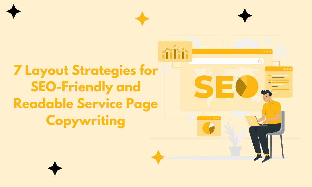
Most service pages read like someone was held at knifepoint and told to repeat “synergy” until their soul left their body. But it doesn’t have to be that way. Good service page copy can hit both ends, it can please the SEO robots and keep actual humans from bouncing in under three seconds. You just have to stop writing like a brochure and start building like a blueprint.
The secret? Structure. Pace. Simplicity. And knowing that people don’t read, they scan, click, and leave.
Here’s how to stack the page so it actually works? Here’s what the experts recommend…
Use Modular Sections with Clear H2s
Break it up. Chunk it out. Give readers something to latch onto before their eyes glaze over.
Implement Inverted Pyramid with FAQ Schema
Start with the meat, not the garnish. Then let Google chew on the structured bits.
Answer Core Questions Upfront
No one’s scrolling to paragraph six to find out if you install boilers in Bristol. Say it fast or say goodbye.
Adopt Problem-Solution-Proof Layout
Here’s what’s broken. Here’s how you fix it. Here’s someone else you fixed it for. Done.
Create Headers That Mirror Search Intent
Don’t write clever. Write obvious. If someone’s searching for it, make it a headline.
Front-Load Action Links for Quick Access
Don’t bury the “book now” button like it’s a treasure hunt. If they want to click, let them.
Guide Users with Z-Pattern Layout Design
Eyes move in a zigzag. So should your design. Left to right, top to bottom and don’t make them think.
You’re not writing poetry. You’re building a ladder — step by step — that gets them from curiosity to conversion without making them work for it. Keep it tight. Keep it useful. And for the love of all things clickable, stop writing walls of text no one asked for.
Table of Contents
ToggleUse Modular Sections with Clear H2s
One layout strategy I always recommend for service pages is to use modular, scannable sections with clear H2s that align with user intent. Start with a strong headline and summary at the top, then break the page into predictable sections like: ‘Who It’s For,’ ‘How It Works,’ ‘Key Benefits,’ ‘Pricing or Packages,’ and ‘FAQs.’
From an SEO perspective, this makes it easy to target long-tail keywords and answer specific search queries within each section. From a user perspective, it improves readability and helps them find exactly what they need, fast.
The goal is to serve both the person and the algorithm. Clean structure, clear hierarchy, and content that flows with intent, that’s what gets results.
Rizala C., SEO Expert, Intent Generation
Implement Inverted Pyramid with FAQ Schema
Don’t wait to get to the point. Open strong — lead with a clean, benefit-packed headline that tells people exactly what’s in it for them. Give them the overview right there: what the service is, why it matters, and how it solves their problem. That’s your hook.
Then drill down. Break the rest into sharp, scannable sections — each with its own H2 or H3 — and don’t be stingy with keywords. Keep it readable. Keep it relevant.
At the end, toss in a no-nonsense FAQ. Real questions, real answers. Format it like a human wrote it, then tag it like a machine wants it — with schema.org’s FAQPage markup. That way, your content’s not just helpful to readers — it’s irresistible to search engines.
Amir Husen, Content Writer, SEO Specialist & Associate, ICS Legal
Answer Core Questions Upfront
One layout strategy I strongly recommend for service pages is this: answer the core question or keyword intent right away—ideally in the very first sentence or paragraph.
For example, if your page targets the query “What is the average marketing budget for SaaS startups in fintech?”, don’t start by explaining what a SaaS company is or giving general startup advice. Just give the answer up front:
“Most fintech SaaS startups spend between €5,000-€20,000 per month on marketing, depending on growth stage and funding.”
Then, once the user has their answer, you can dive deeper with supporting context, breakdowns, use cases, or related insights. This structure improves readability, boosts engagement, and increases your chances of being featured in AI overviews or search snippets, because it shows search engines you’re addressing intent directly.
Heinz Klemann, Senior Marketing Consultant, BeastBI GmbH
Adopt Problem-Solution-Proof Layout
Use the “Problem-Solution-Proof” layout. Start with a bold H1 that mirrors the search intent (the problem), follow with a scannable section explaining how your service solves it (the solution), then layer in social proof, FAQs, or results (the proof). This layout naturally weaves in keywords, keeps bounce rates low, and makes it dead simple for both Google and humans to understand why your service matters. It’s structure with strategy.
Justin Belmont, Founder & CEO, Prose
Create Headers That Mirror Search Intent
Use your headers like they matter. Make every H2 a search term someone would mutter under their breath. “How do I get this done fast.” “Is this even worth the price.” “Can I skip the phone call.” Write those exact thoughts out. Then answer them clean. One paragraph. Two bullet points max. White space in between. No rambling.
You want SEO? Give it edges. Google cannot rank blur. Use questions people type, pair them with answers people remember. No long intros. No fluff at the top. Your first 400 pixels should look like someone wrote it for attention-deficit toddlers. Most people skim. Google reads what they skim. So build the page like a checklist, not a brochure.
James McNally, Managing Director, SDVH [Self Drive Vehicle Hire]
Front-Load Action Links for Quick Access
Top-load the action links. On the first scroll, every Call-to-Action (CTA) should be in view. I’m talking about buttons, phone numbers, and calendar links—front-loaded, colored, and properly spaced. No animations. No hover effects. You want speed. Heat maps show one thing: people stop when they encounter friction. Don’t make them scroll for the next step. Give them all three options at the start.
Then stack the body content like a drill-down. Each block should answer one version of “Why should I care?” One issue, one solution, one price point. Then break it. New line. New header. Reset the scroll behavior. Force a pause with short lines and white space. Layout can make or break your sales. If your margins are poor, your conversions will be too.
David Struogano, Managing Director and Mold Remediation Expert, Mold Removal Port St. Lucie
Guide Users with Z-Pattern Layout Design
People don’t read — they scan like hawks. And their eyes move in a Z: top-left to top-right, then they drop, then they shoot across again. That’s your map.
Use it. Plant the headline and CTA in the corners where they land. Stack subheaders where the eyes fall. Don’t clutter the path — guide it. The Z-pattern layout isn’t a gimmick — it’s gravity. Follow it and the content becomes frictionless. Ignore it and you’re just another wall of words.
Mohammed Kamal, Business Development Manager, Olavivo